Our team of developers, designers and dreamers have been working hard to release IDX Broker’s mobile first template.
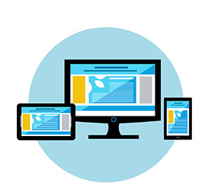 This new layout delivers the same look and style for IDX content across a wide range of devices. If you visit an IDX Broker page with the mobile first template activated, it will resemble the same site on a smartphone, tablet, or desktop computer.
The default layout for IDX Broker pages is mobile first. As mobile devices comprise an increasingly larger portion of total Internet traffic, designers are approaching layout with the mobile experience as a priority.
Our mobile first template is also fully responsive. Place it into a responsive theme and watch the content scale up or down automatically, depending on the screen size.
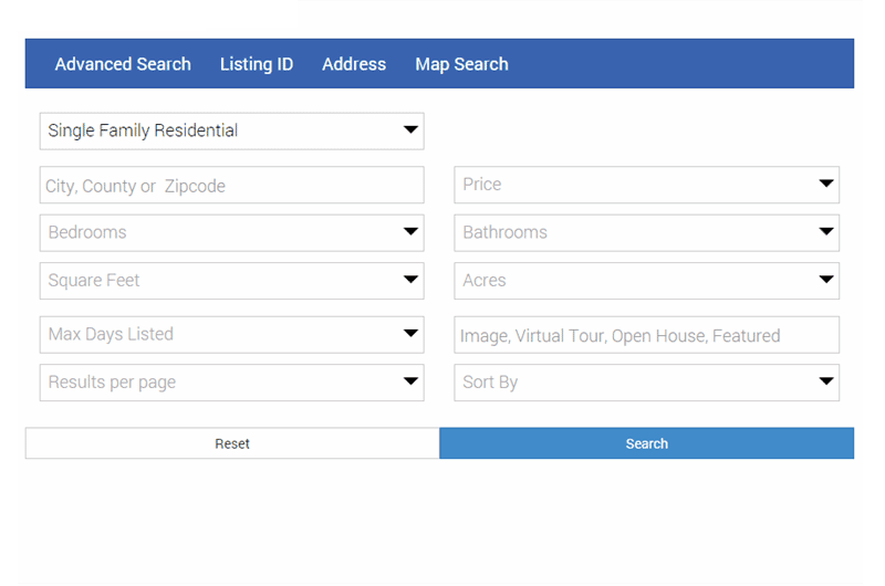
Instead of standard lists, each field defaults to a quick-list. On selection, a field shows a dynamic list of options to choose from.
City/county/postal code search options are now a single field – just select and begin typing. IDX Broker recognizes the text as you type and uses the appropriate location field in the search. Any secondary refinement searches will continue to use this location field.
If your site is already responsive, you may want to turn off our mobile wrapper so you can fully use this new theme. If your main site isn’t responsive, keeping IDX Broker mobile wrappers activated may be a good idea.
We hope you like the new look! We’ll continue working on new templates so you’re always showing listings in the best possible way.