• Mobile first templates in IDX Broker make it easier for all visitors to use your site. Reward your mobile and/or template-based visitors with a seamless experience, easy navigation and clean layouts. Learn more about mobile first templates. In early 2015, we launched our first set of Mobile First IDX templates. These user-friendly layouts work across a range of devices to provide: A seamless mobile experience throughout your site Layouts and site design ideal for mobile browsing Easy to use site navigation across a range of devices According to iMediaConnection, approximately 25% of Americans only use their mobile devices to access the internet. Think about that. An entire quarter of your potential buyers could be annoyed by your website design and layout. Ask yourself: Do my visitors have to pinch and zoom just to fill out a simple form? Do they have to find a hidden link, under just the right lighting in order open new content? Does the mobile version of the site remove features or otherwise limit the user? If you purchased a site built in 2007 to recycled and re-purpose the layout, you're are in for a surprise. The notion of providing a mobile first experience is going to drive every website" discussion for the next decade. Why? Because the concept of a website has changed. It's become about one thing - simple functionality. Much like an app; visitors to your site ask themselves -what do I need from this site? Did they provide me with access to the information or data that I need? No more fancy toggles, sliders, and other garbage that looked cute in 2007. They're seeking to perform an action. and they want simple functionality. Mobile first isn't just a simpler layout, or a more polished layout for mobile devices - it's a concept that puts your mobile users at the top of the food chain.

Reward Your Visitors with Mobile First IDX

Categories: IDX Broker How-Tos|Tags: , , |

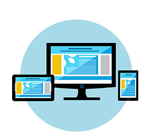
Mobile first templates in IDX Broker make it easier for all visitors to use your site. Reward mobile and tablet users with a seamless experience, easy navigation, and clean layouts. Learn more about our mobile first templates. In early 2015, we launched our first set of Mobile First IDX templates. These user-friendly layouts work across a range of devices

  • mobile search and tablet

Mobile Search is Changing (Again)

Categories: Real Estate Technology|Tags: , , |

If you've been paying attention to Google in the last decade, you won't be surprised to hear they're changing how they index websites - again! This time, they have mobile optimization in their sights. The change is set for April 21 and here is what you need to know. Searches are Changing - Now with More Mobile You

IDX Broker’s Mobile First Template

Categories: IDX Broker How-Tos|Tags: , , |

Our team of developers, designers and dreamers have been working hard to release IDX Broker's mobile first template. This new layout delivers the same look and style for IDX content across a wide range of devices. If you visit an IDX Broker page with the mobile first template activated, it will resemble the same site