You asked, we listened…
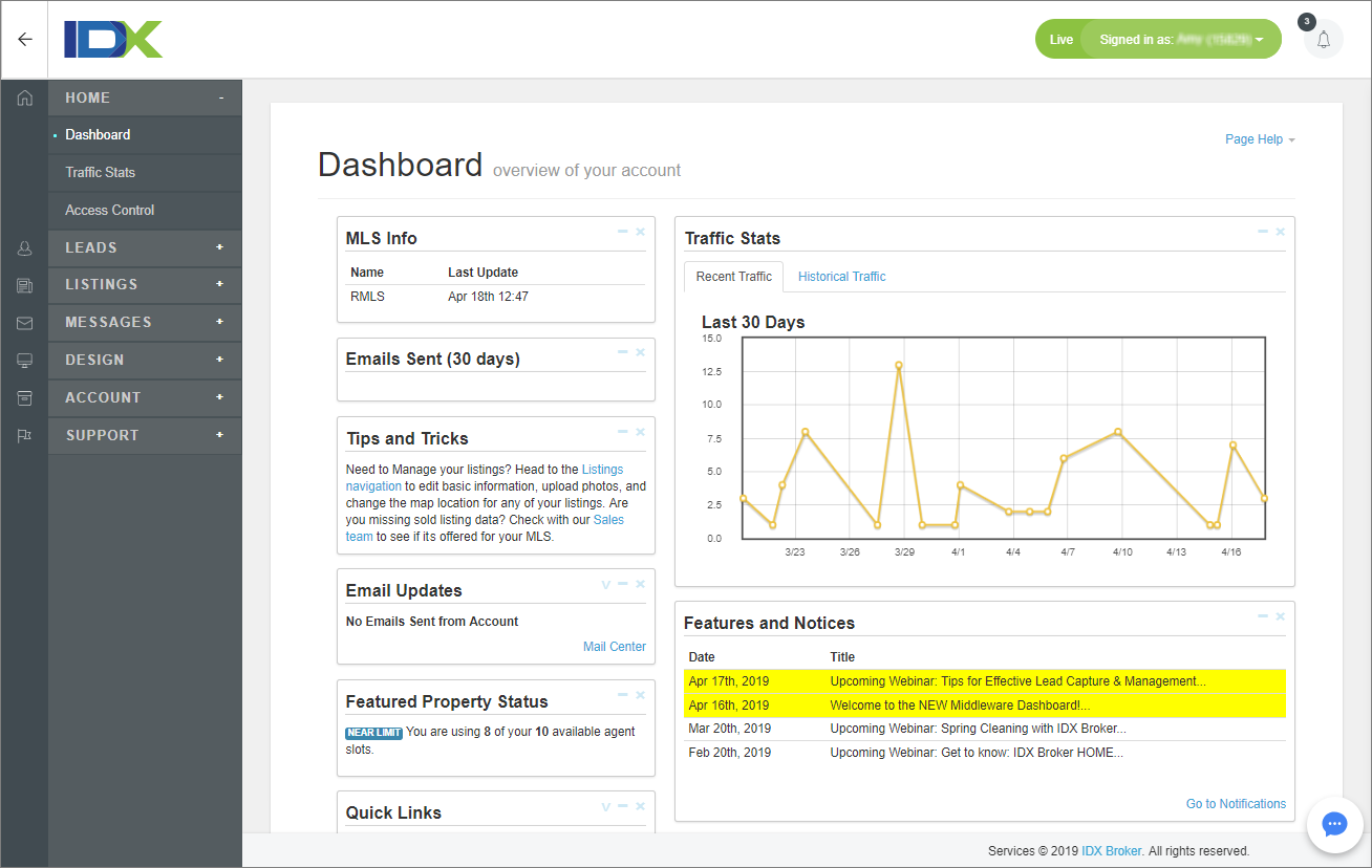
Or more accurately – you asked, we moved forward in a measured, focused, and purposeful way. It’s finally here – the NEW IDX Broker Dashboard!
As with any new user interface design, particularly with aesthetic AND organizational changes, our primary goal was to deliver an optimal user experience. There’s nothing more frustrating than knowing where you want to go, but not knowing how to get there.
At IDX Broker, we’re lucky to have Julia, our Creative Director, who has a strong commitment to making things clean, simple and intuitive. She also has a vision which extends far beyond the goals she’s helped us reach in the short-term… so you can expect more exciting (and aesthetically pleasing) updates down the road!
Today, we wanted to sit down and talk with Julia about her creative process, what went into the product design, and what she thinks real estate pros can put into their own sites.
Here’s what she had to say…
IDX: Aside from being more modern, what are the top 3 improvements to the new dashboard?
- The new navigation is scalable. This way, as we improve the structure of Middleware and add new features, it will be simpler for us to implement changes. Plus, it will help our clients find what they’re looking for more easily.
- The collapsible left side navigation allows our clients to minimize the navigation to make full use of their browser and workspace.
- With expandable menus and the full architecture accessible from any page, users will be able to make their way through the application more efficiently.
IDX: Talk us through the process, what went into the Middleware design decisions?
Every design has an expiration date and ours was at that point. It was time to adopt a modern design that reflects who we are: a modern, real estate tech company and a leader in our industry.
My role, the role of UX design, is to improve the application and make it useful, intuitive, and fun. We have so many exciting projects on the horizon – all with the goal of capturing more leads for our clients and giving them the tools they need to be more productive and profitable.
IDX: What client “pain points” were you trying to relieve with the new design?
I wanted the architecture to be clear and intuitive, making it easy to scan content and get to the information the user is looking for… fast. The layout of the old navigation could be challenging to scan – users had to open and close screens to navigate. This takes time and can sometimes be confusing. The new navigation allows the entire Middleware framework to be available from every screen, making it more efficient.
The new navigation is available when the user needs it, but they also have the option to hide it. This gives our users more work space and the ability focus on the task at hand without distraction.
I also wanted to plan ahead and make the new navigation scalable. This update “retrofits” our old nav while allowing us to improve and implement changes to the architecture with ease. We have plans to introduce new features, which we will be able to add seamlessly!
IDX: So, how can realtors apply some of this design thinking to their own sites?
In a few ways! However, the structure of your site will determine which type of navigation is best to use and helps traffic flow.
If you have simple navigation (with only one or two levels of content), placing the nav at top of the browser may be the way to go. Consider making it “sticky” so that it’s always visible. This means your content will appear to scroll behind the nav bar and the user will never have to scroll up to find it.
Design-wise, the look of the navigation should reflect your brand and how you want to represent yourself. If you are selling lofts to city dwellers, the look might be very different than if you are selling cabins in rural areas.
Structurally, be sure to put content in logical categories that will make sense to your prospects. Leads should never have to think about navigation. Highlight local, well-known areas, but don’t use catchy names for categories. Use simple language which clearly defines the content.
Also, don’t try to put everything on your homepage or top-level navigation. More navigation upfront means the lead has more time to look around and debate what to do first. Take a “less is best” approach when possible. Give them everything they absolutely need to know and nothing they don’t.
To sum up – navigation is important. If a user can’t move through your site with ease and find what they’re looking for, they might become frustrated and decide to look elsewhere. Take the time to evaluate your navigation and make sure it’s user friendly!
We hope you love the new Middleware Dashboard as much as we do!